
Case Study 1
Youtube Feature: AI Mixer
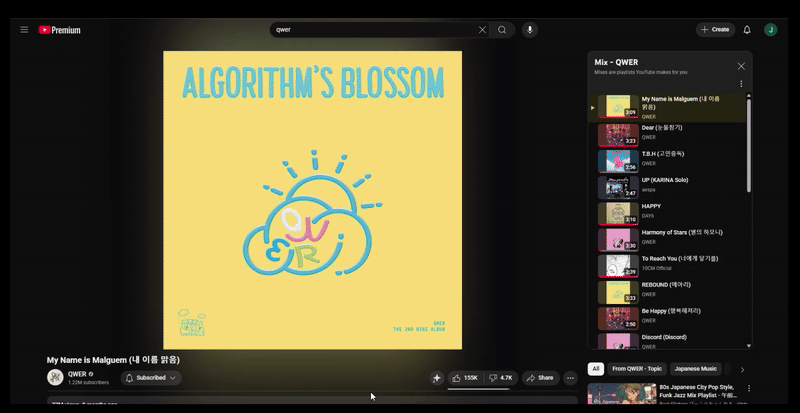
Mixing YouTube audio for musicians inside the browser

Overview:
As a musician who has played bass in church for 4 years, I have been able to collaborate with many different musicians in a lot of band settings. One reoccuring issue I found was not being able to hear melodies or lines from the original songs, having to rely on 3rd party tools on top for YouTube tracks/songs.
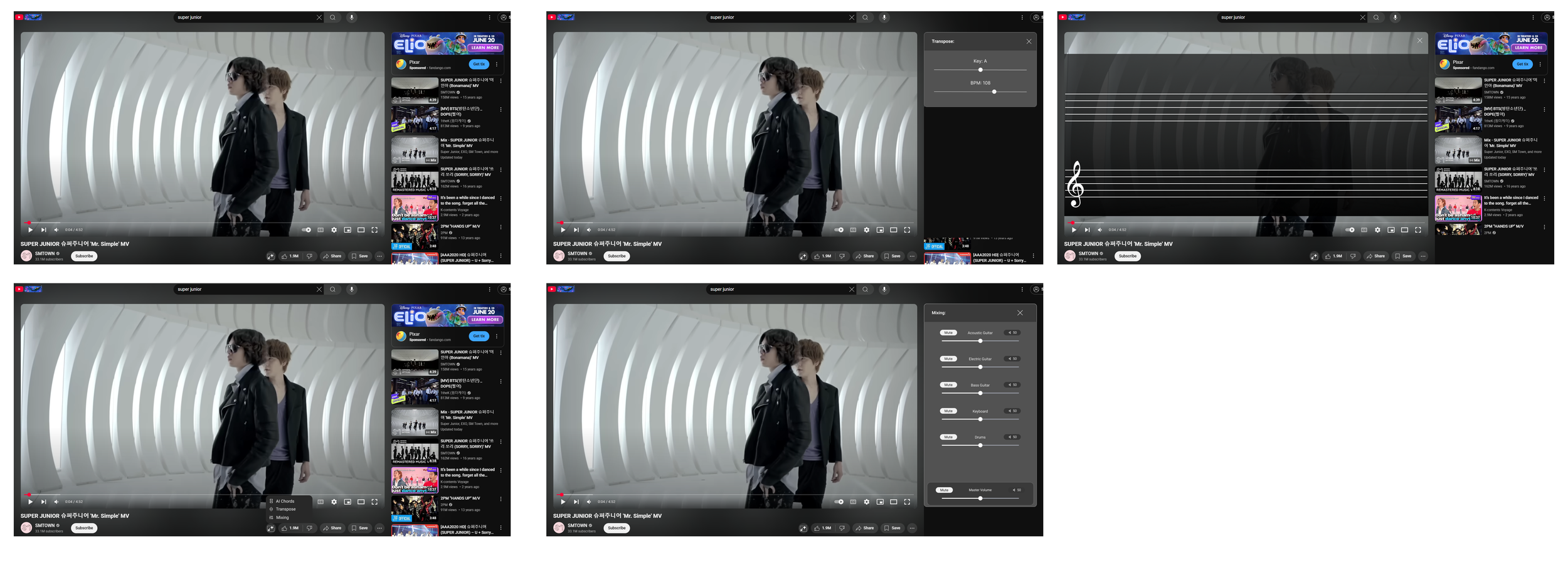
Through these feedback and discussions, the idea of YouTube Mixer came to be. YouTube Mixer is a feature that allows users to adjust track instruments and vocals and change key registers all directly in YouTube, allowing for musicians to practice quicker and easier from anywhere they need to.
Role:
UI/UX Designer
Duration:
4 Weeks | August 2025 | Capstone Project
Process:
User Research and Synthesis, Solutioning, Prototyping, Usability Testing
Problem:
There are a lot of resources and 3rd party applications that are used for musicians to practice and learn. However most people learning music use Youtube as their source of music and there are no onsite applications that give users easy access to tools like transposers and music mixing.
So how might we allow users to isolate certain instruments in YouTube?
Youtube AI Mixer’s goal is be a one stop shop, where users to use Youtube simutaniously with all of the tools needed to be musically successful.
Emphathize - Research Process
Initial Research
Competitive Analysis
I initially did research to see what the other music competitors were doing with their technology compared to YouTube. This initial goal with this research was to see one thing: what technology the other sites were using to allow users freedom to practice.
My analysis showed me that many of these music sites were not doing anything to help users with their practicing journey. I realized that by creating this for YouTube, this feature be the pioneer for audio mixing built inside the system, giving YouTube a first-mover advantage.

Emphathize - Research Process
User Interviews
User Interviews:
I conducted interviews with 6 users, 4 users who were musicians and 2 users who use YouTube for personal/casual use. I believed that because I wanted to create this for musicians, that most of my information should come from the musicians. However, after doing more interviews I was made to realize that there I do need to contain my biases and make sure to allow users to share their story and painpoints! Many thing in which later case studies reflect that.
Affinity Mapping Insites:
Most musicians using 3rd party applications had a hard time because of the time consumption of opening both 3rd party apps and YouTube. More set up = less time to practice.
People who wanted to hear certain parts of songs did not have the freedom to hear those certain parts.

Affinity Mapping of the common pain points of users
Emphathize - Personas and User Flows
User Personas
Through the User Interviews many common issues kept popping up, particularly people wanted a way to listen to specific parts of the music better.
Earl Earnest was my persona that I created. Earl Represents the users that would need the AI Mixer feature. Users who want:
To change keys of the songs that they are listening to
Allowed to hear specific instruments in songs that they want to learn.
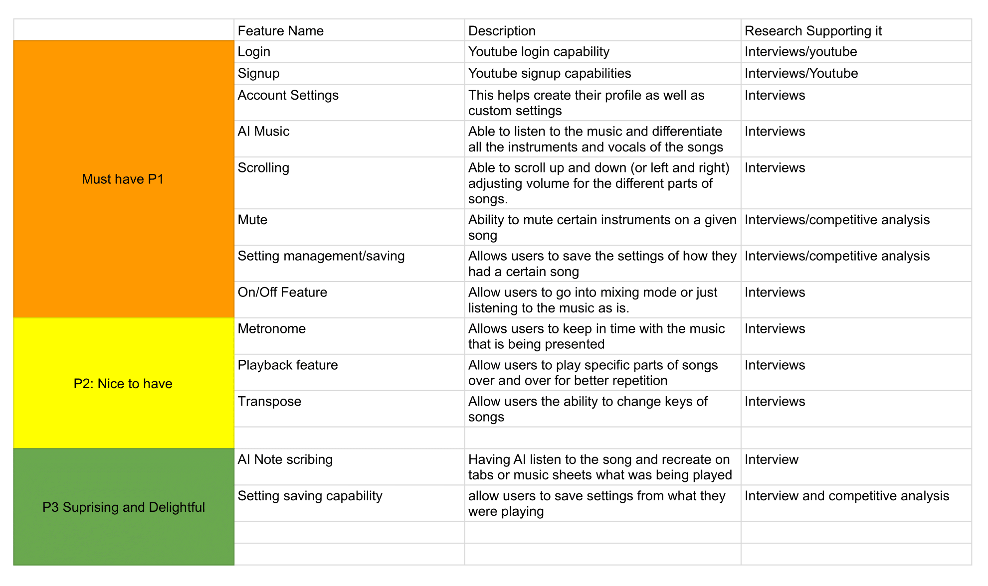
Feature Set
Once I was able to organize what users needed, I proritized the features needed for the YouTube mixer.
Personal Reflection
Although I wrote all of these down, I ran into the problem of not focusing/prioritizing my features. In later capstones, I learned to prioritize and stick to the scope of the project, rather than trying everything all at once.
User Flow:
Once the feature set and user personas were made, I was able to make the user flow. Since I am adding a feature onto an established site, the process was quite simple; having users login, go into a video, and click and use the YouTube mixer feature.

Prioritizing/User Flow

Defining
Ideate - Wireframes
Design
Low Fidelity Wireframes:
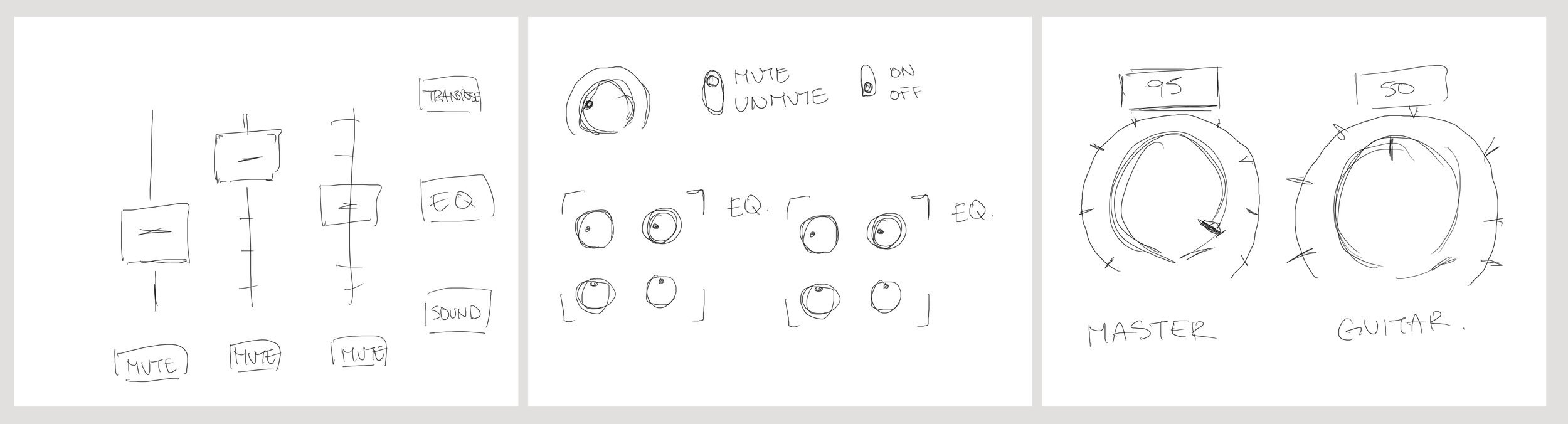
With the design, I wanted to keep the feel of a music mixer to encorporate into YouTube. However it came to me that there were a couple of design options which I experimented with:
Knobs
Sliders
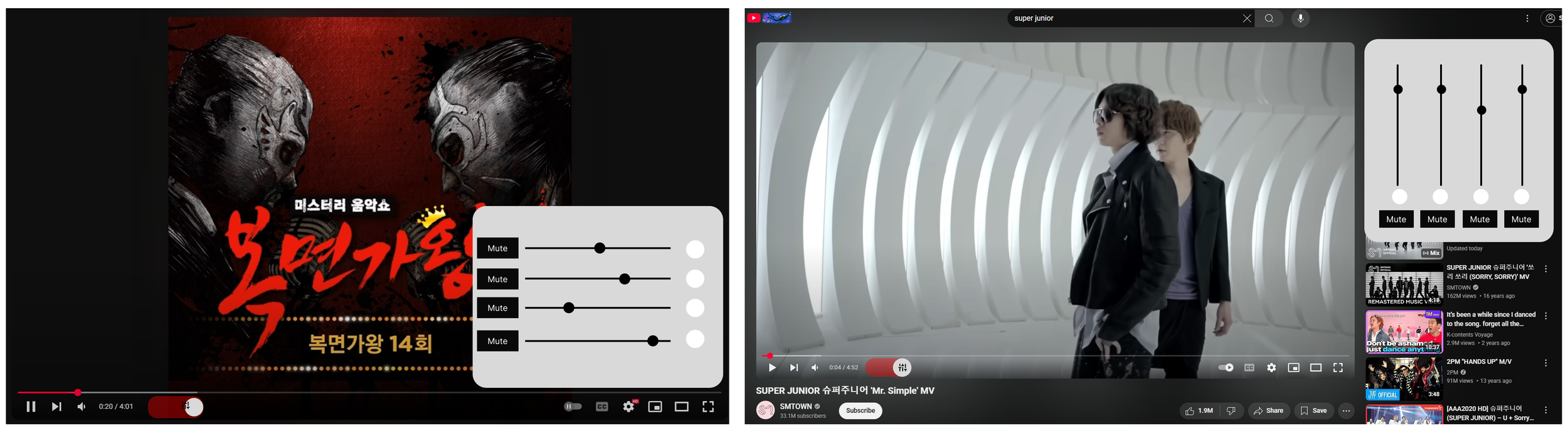
From personal experience, I found digital knobs to be quite finicky and so the decision to go with sliders was decided here. I also thought having a slider with also give more familiarity with YouTube (having the volume as a slider as well as playback on videos being a slider.
Mid Fidelity Wireframes:
After deciding on the design, I developed these ideas into a more stylized version of the rough draft.
Design- Mood/Prototyping
UI Look and Feel
During the design process, there were pros and cons that I learned about adding a feature to an already established site like YouTube. The advantage is because YouTube is already established, color and design choices can be borrowed from what YouTube already has, saving time on some design. However, keeping the vibe of YouTube while establishing a new entity entirely was not as easy to accomplish.
To narrow down my design choices I looked at a couple features YouTube has and prioritized familiar tropes:
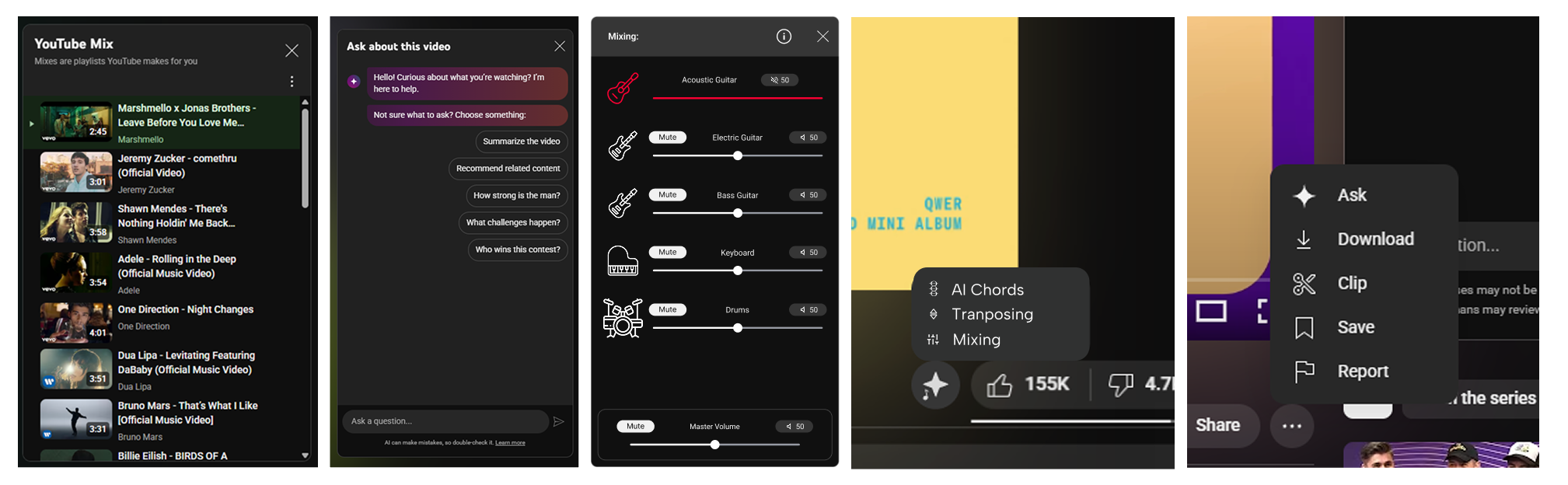
YouTube has an ‘ask’ and ‘mix’ page. By using the design layout of these pages, I created the outline and color of the mixing and transposing attachment of the feature.
YouTube videos have a “More Options” Button which displays other features that users can use (i.e save video or download video). Using this example, I decided to create my mixing feature into a button likewise
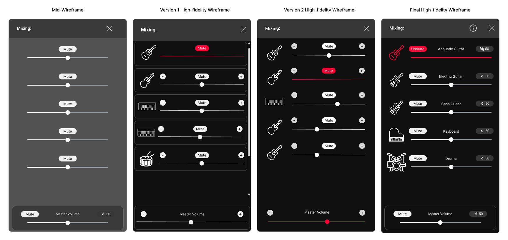
Iterations to the Mixing Element:
Once the user testings were complete, iterations and revisions to the wireframes were made
Added instrument Icons to indicate which instrument volume is being changed
Added a description to instruments for the case of multiple of the same instrument
Wanted clearer way to mute an instrument and made the icon also turn red and changed to say “unmute” when muted
Added a volume and mute in place of - and + through user testing finding it reduntant.
Iterations to the Transposing Element:
Changed the accent color to white. Users thought red ment ‘mute’ and caused confusion
Iterations to the AI Mixing Button:
Many users indicated having a simplier design would be better.
the square design was too busy with the design, and so I simplified the button to become an AI star with a music note.


Design- Mood/Prototyping
Testing and Iterations
Low/Mid Fidelity Wireframe User Testing:
After creating these wireframes and testing them with the same users I found a lot of discoveries. Particularly 2 I want to highlight that grew me as a designer:
1.Originally I had a focus on trying to allow flexibility to musicians. However one user (who dances and has taught dance) shared with me:
I learned that I cannot let my biases and target audience shouldn’t limit who is able to use the application. Although through the user testing many musicians asked when certain niche features would be added, I decided to keep the initial design simple. This would allow new users to grasp the concept quicker and reach further audiences that would otherwise not use the feature
“I could definetly use this for dancing. Sometimes I can’t hear the kick drum, so I could use this to hear certain parts of songs I want to emphasize through my dance” - Chang
2. Sticking to Priorities. Originally wanting to create three features, the feature I ended up dropping was “AI Chords”. Designed to be an overlay, users expressed this felt out of place with the other features that were added. After contemplating about keeping the feature, I realize that this wasn’t a priority for Mixer feature, which at this point I dropped.
Design- Mood/Prototyping
High Fidelity Prototype:
Prototype User Testing Results:
I tested the prototype with 4 users, 2 who tested since the low fidelity wireframes and 2 who have never seen this project for the first time. The overall results were successful
AI Button Placement: Users were able to find the button and get to the functions. All of the users were able to get to the mixer and transposer without any issues or guidance during testing.
Mixing: One user pointed out a flaw of when muting didn’t change color, which was quickly fixed for the other 3 testers. Overall functioned great and 1 user who isn’t fluent in music quickly picked up on how to use the mixer.

Takeaways/Reflections
I had a wonderful time with this project. I love playing music and to try and problem solve a problem that I had for a while was something that grew my passion for the project. Some take aways from this project:
Understanding that every user is an opportunity for growth. To listen to each individual and expand horizons
Prioritize and differentiate what is needed for this to succeed and what are some good ‘Good to keep in mind’
Learning to take an existing site and encorporating design to match the overall aesthetic.
