
Case Study 2: Responsive Web Design
Poki Run Page Redesign
Bringing a brighter and clearer Poki to you
Overview:
Redesign of the restaurant Poki Run. Giving users a colorful and clear visuals of what the restaurant has in store.
Role:
UI/UX Designer
Duration:
4 Weeks | September 2025 |
Capstone Project
Process:
User Research and synthesis, Solutioning, Prototyping, Usability Testing
Problem:
Although locally know this place well, for a first time eaters, trying to understand what this restaurant offers can be a bit hard to understand. Their current website does not describe some of the important foods that they offer, example Blueberry Mayo dressing or Unagi Sauce, which can leave users confused while ordering online.
How might we allow users to create decisions through the images/menus put out?
The goal of the revamp of PokiRun website is to allow users easier access to the menu details with clear visuals, alongside giving the website more pop.

Picture of Poki Run’s website at the time of the project.
Emphathize - Design Process
Initial Research
Competitive Analysis
I conducted research to get a feel for what other restaurants are doing with their restaurant pages.
Pokeworks and Poke House are popular Poke competitors in the area. Mountain Mikes is a neighboring restaurant and wanted to see if they are doing anything different. Doordash for the base of online order interaction and wanted to research them as well.
The biggest insights as I was researching these restaurant websites was their unique character and clear menu understanding. All have their different color scheme and story that help to give a unique experience in each one. As well, finding what was on their menu was easy to understand and clear what the restaurant sold.
User Interviews:
I conducted interviews with 5 users who have a wide variety of ordering out from restaurants/online websites. I focused on people who were in their 20-30 age group range. With having a wide variety of participants who eat and do not eat out often, this helped to share with me what first time users have problems with, while what drives away users who use apps often
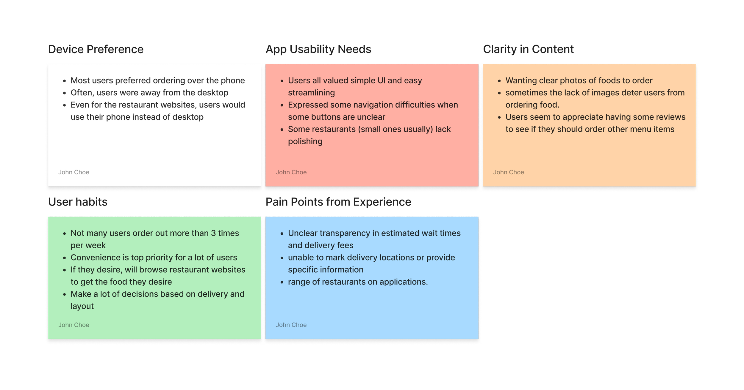
Things that I have found through my user research:
Users like clear and quick access to menu and items. The less misunderstanding, the quicker they are inclined to order.
Clear visuals of food for restaurants that they are visiting for the first time. Allows users to see what food are available and to make a better decision on what to eat because of that.

Emphathize - Design Process
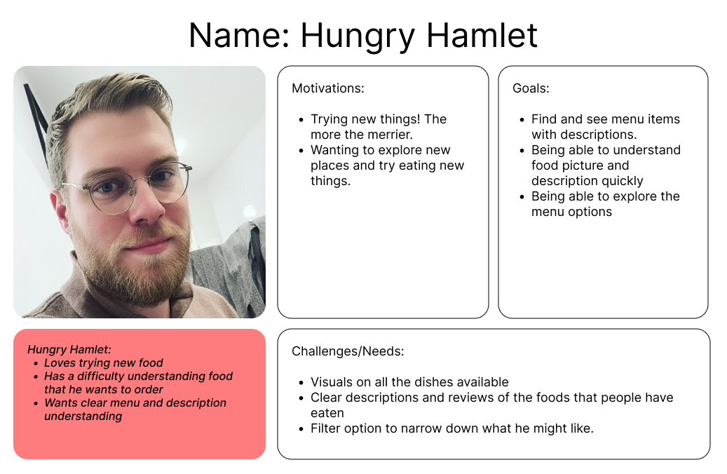
User Persona:
Through the initial research, my direction was clear. Users want:
Visuals are clear to users
Food and colors of the website help to enhance the experience of the users.
Hungry Hamlet is the persona that carries those pain points and helped me work towards that goal.
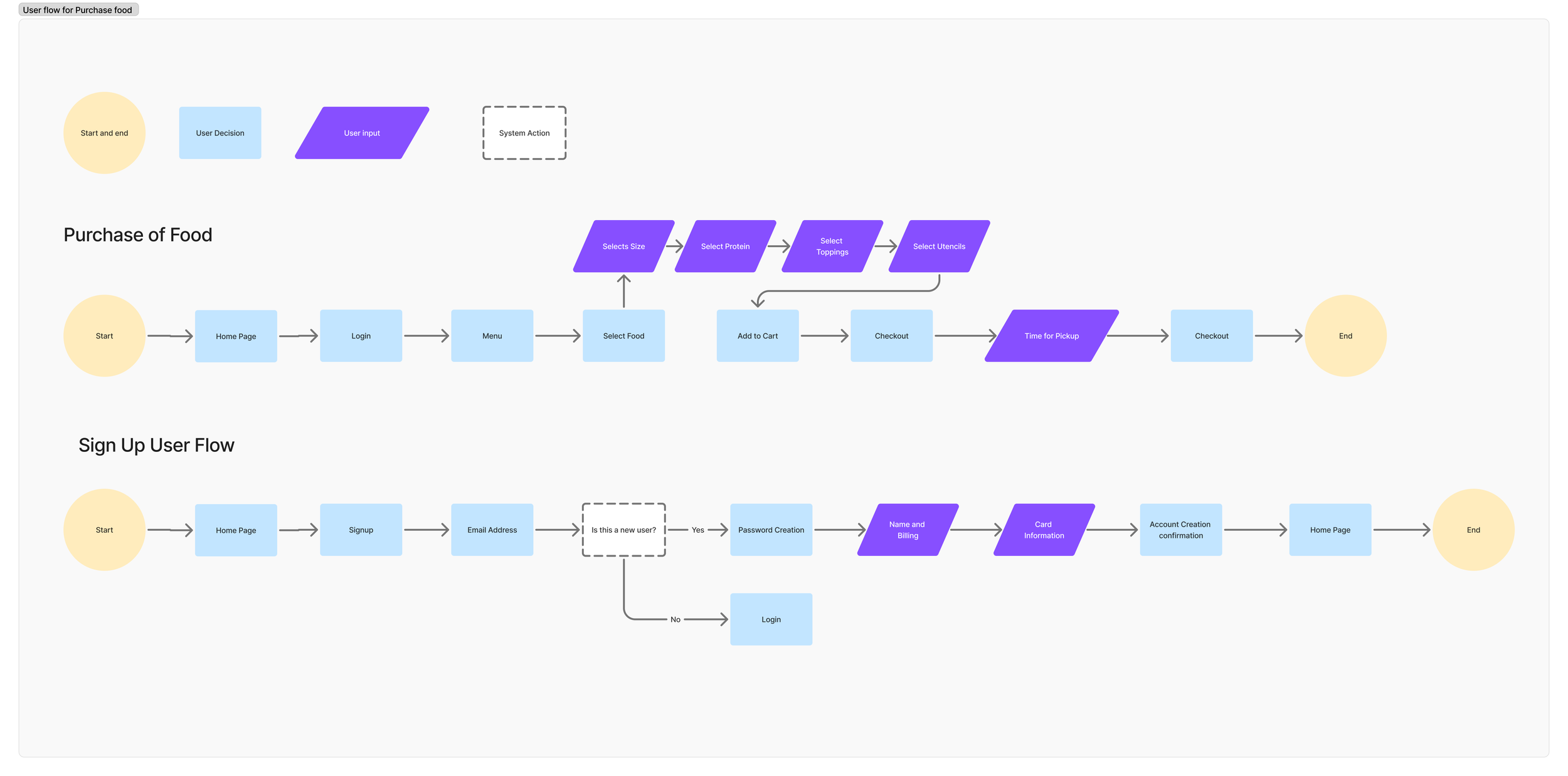
User Flow
After creating the persona I made a user flow of what would need to be made for the pages and functions for the users. There were 2 aspects that needed to be tackled:
Page for menu and other foods that they offer
Sign Up for points and account creation
Defining Persona
Ideate - Wireframes
Design
Low Fidelity Wireframes:
With the initial website of Poki Run, there was no basis to go off of when starting. I decided to research and find what works for more established online websites to start making some blueprints of what the website would look like. Through the research I wanted to focus upon a couple aspects:
Simple big initial screen that shares the restaurant name along with a clear ‘order now.’ I found this allows users to order quickly (for those who know what they are going to order) while allowing other users to scroll down and see the menu right away.
Dropdowns of images. Many obscure or items that do not need to be shown to everyone were made into dropdowns which I thought was a great way to keep pages clean but allows users information.
Mid Fidelity Wireframes:
I started to implement the above mentioned discoveries through my mid fidelity wireframes.


Low/Mid Fidelity Wireframe User Testings:
I tested some of these initial ideas with 5 users who all participated in my initial research interviews. For the testing I wanted to see if users can understand the layout of the website along with when looking at the menu, find how to create a bowl along with what goes into each customizable bowl.
My findings were:
Users found that the menu ‘pick your bowl’ area was too cluttered
One user explained ‘if I am going to scroll through the page anyways, then stack the build page so that I can see everything as I scroll’
Need more visuals in the menu page.
A different user explained ‘I don’t want to have to click two buttons to access images. I would rather have them up right away to see as I scroll’
Through these findings, I was able to change some aspects to meet user expectations.
Design/Mood Inspirations
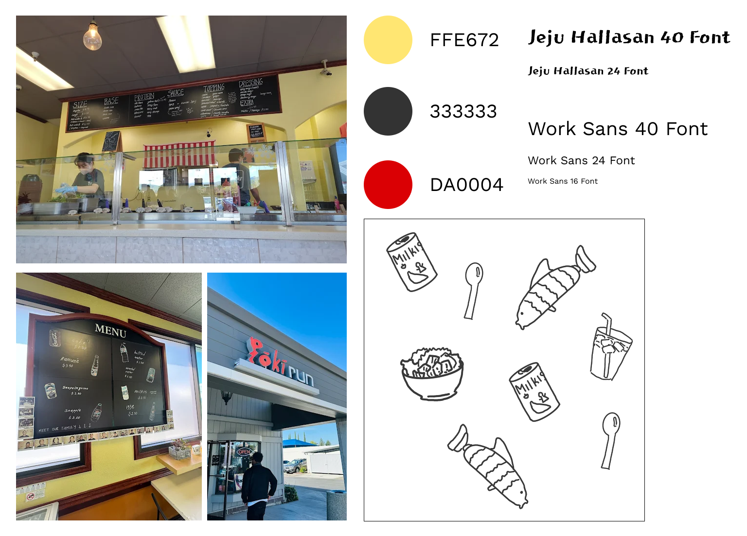
Starting from scratch had a lot of difficulties that arised compared to my other projects. What color should I incorporate? What theme should I add? How do I make the this website unique? I decided to go to their location for inspiration and found where my theming would come from: the restaurant itself!
I loved the color theming of the restaurant. I wanted to try and use the yellow and black and use the red for the accent color
They have a lot of hand drawn menu items and instructions in their store. I wanted to use the black and the font choice to reflect a bit of that feeling of chalkboard along with drawing some images like in their menu.
These started to become the baseline for the website and grow from there
Iterations
Design - Mood/Prototyping
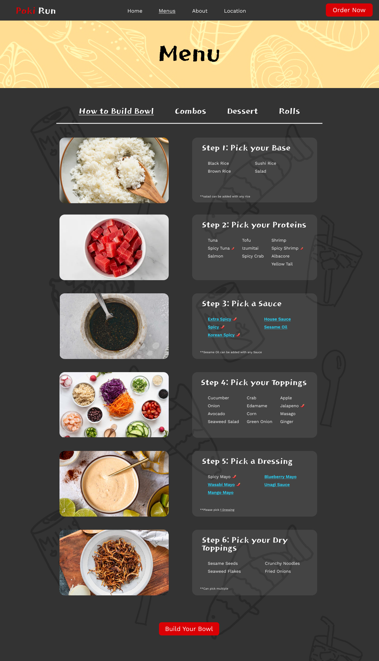
High Fidelity Wireframe
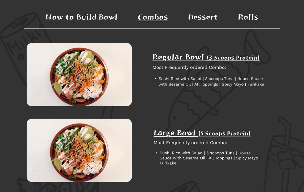
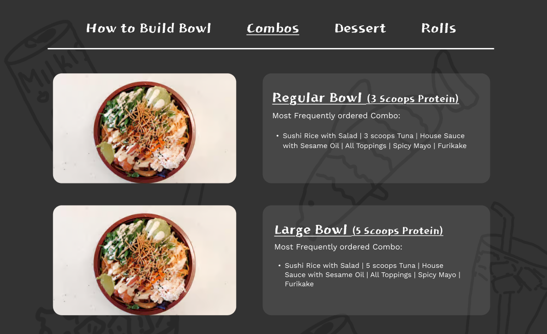
After testing the lower fidelity wireframes, I decided on some changes that were made into the high fidelity wireframes
I originally had the menu bigger, which caused users confusion, users did not realize they needed to scroll down for the menu. By changing the menu to be icon to be smaller and bringing up the physical menu, this shared to users to scroll and go down.
Added a backdrop to all of the steps for more clarity. Some users indicated visual issues with the background images.
Added physical links for the sauces and dressings for easier access to dropdowns for the sauces underneath the steps.
Added images on the left to show what foods were being talked about.
High Fidelity Prototype User Testing
I tested some of these initial ideas with 4 users who all participated in my low and mid fidelity testings. Although many of them already knew the design, a lot of meaninful input was given from them (from perspectives of users who frequently order online to 1 user who only orders online once every couple months) and decided to continue to work with the same users.
User commented about adding an indicator for spicy foods saying “I can’t handle that much spice, so having an indicator helps me to know (even if it is pretty obvious with the name)”
Added to add some background to the text for better visability. Although she says she can see it, maybe for others it might be a hard time.
For dropdowns, one user explained he wanted images for the sauces and dressings as well.
After hearing all the testings, I implemented them into the final design and created what is the prototype
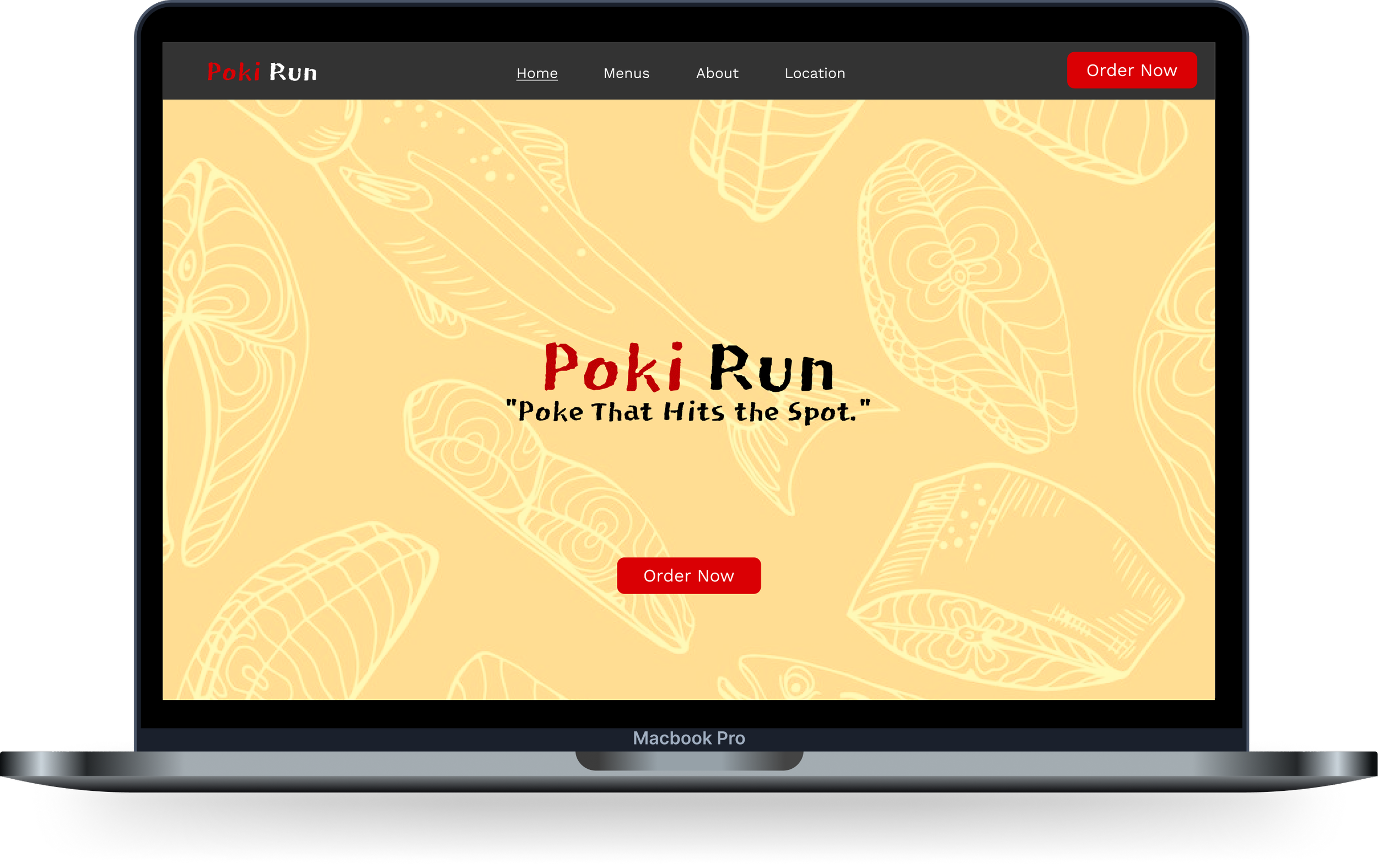
High Fidelity Prototype:
Takeaways/Reflections
This project showed me the different perspective needed while tackling a business to consumer directly website. Many times I thought of an idea, which did not translate well because of the aspect of the customer not being aligned.
Through it all, I was able to express and be more creative being a redesign of a website. However, I knew needing to make it appealing to customers was the most important. To help my work flow, I had a note on my Figma of the aspects I needed to make sure I tackled, which helped tremendiously to make sure my focus/vision was clear.
